Redesign, UI/UX, Case Study -
WP Wheels
WP Wheels is a leading provider of effectual WordPress themes and plugins with dynamic features. Our products are designed to enhance the functionality and aesthetics of your website, providing an exceptional user experience. With a focus on innovation and quality, we offer a diverse range of themes and plugins that cater to various industries and niches.
project overview
A client asked the team to design and develop a theme store website for a commercial IT Company. Trust WP Wheels to elevate your WordPress website and unlock its full potential with our powerful and customizable solutions.
- User Friendly interface for easy exploration.
- Minimal and modern Design.
- Well-performing improves user experience.
- Better search engine rankings.
Problem statement -
Agency’s website currently exhibits outdated design elements that give it a corporate feel rather than reflecting our identity as an IT company. Additionally, we acknowledge that the website’s loading speed is slow, impacting user experience negatively.
- Design elements fit for website
- Unnecessary steps on buying process & visit website.
- Icon and graphic design thats fits for website
Possible Solutions -
To address these issues and improve our website, we have developed a comprehensive plan of action:
- Modernize Design: website's design to align it with current trends and industry standards.
- Implement a user-friendly navigation menu: Ensure the website's navigation is intuitive and easy to use. Categorize products effectively, provide clear labels, and consider using dropdown menus or filters to help users find what they need quickly.
- We design icon & graphic which is consistent with the overall visual style and branding of the website.
My Role -
- UI Design
- UX Research
- Project Management
Timeline -
- March 2021 - June 2021
Tools Used -
- Photoshop
- Illustrator
- Figma
my contribution -
In this project, I served as the sole product designer, taking on multiple roles and responsibilities. I took charge of identifying the problem at hand, conducting user research and testing, creating user personas, and designing both the UI and UX. Additionally, I facilitated the smooth transition of the design to the development team, ensuring a seamless hand-off process. Throughout the project, I wore multiple hats and played a crucial role in every stage of the design process, from inception to implementation.
My Design Process
- Research -
- Competitor Analysis
- Problem & Solution
- User Flow
- Design -
- Site Map
- WireFrames
- UI Design
- Prototype-
- Uesr Testing
- Animation
- Client Approval -
- Final Presentation
- Development Proposal
- Design Hand Off -
- Dev Meeting
- Documentation

target user
Who is our target user?
Through a comprehensive analysis of the company’s history and examination of the previous year’s data, we gained valuable insights into the target audience and market dynamics. This research enabled us to identify the specific type of company we should prioritize when designing our website.
Startup Company
69%
established company
22%
Personal Use
9%
By understanding the company’s niche, industry trends, and customer preferences, we were able to tailor our design approach to effectively engage the target market and create a visually appealing and impactful website that resonates with the desired audience.
competitor analysis
What can we learn from competitors?
We conducted a thorough analysis of our competitors’ websites. By studying their design strategies, we identified common elements of simplicity and modernity that resonated with us. Inspired by these findings, we aimed to implement similar solutions on our own website.
user friendly
91%
modern and minimalist design
67%
target customer
97%
- Highligh main products.
- Modern design elements, clean layouts.
- Optimize Loading Speed.
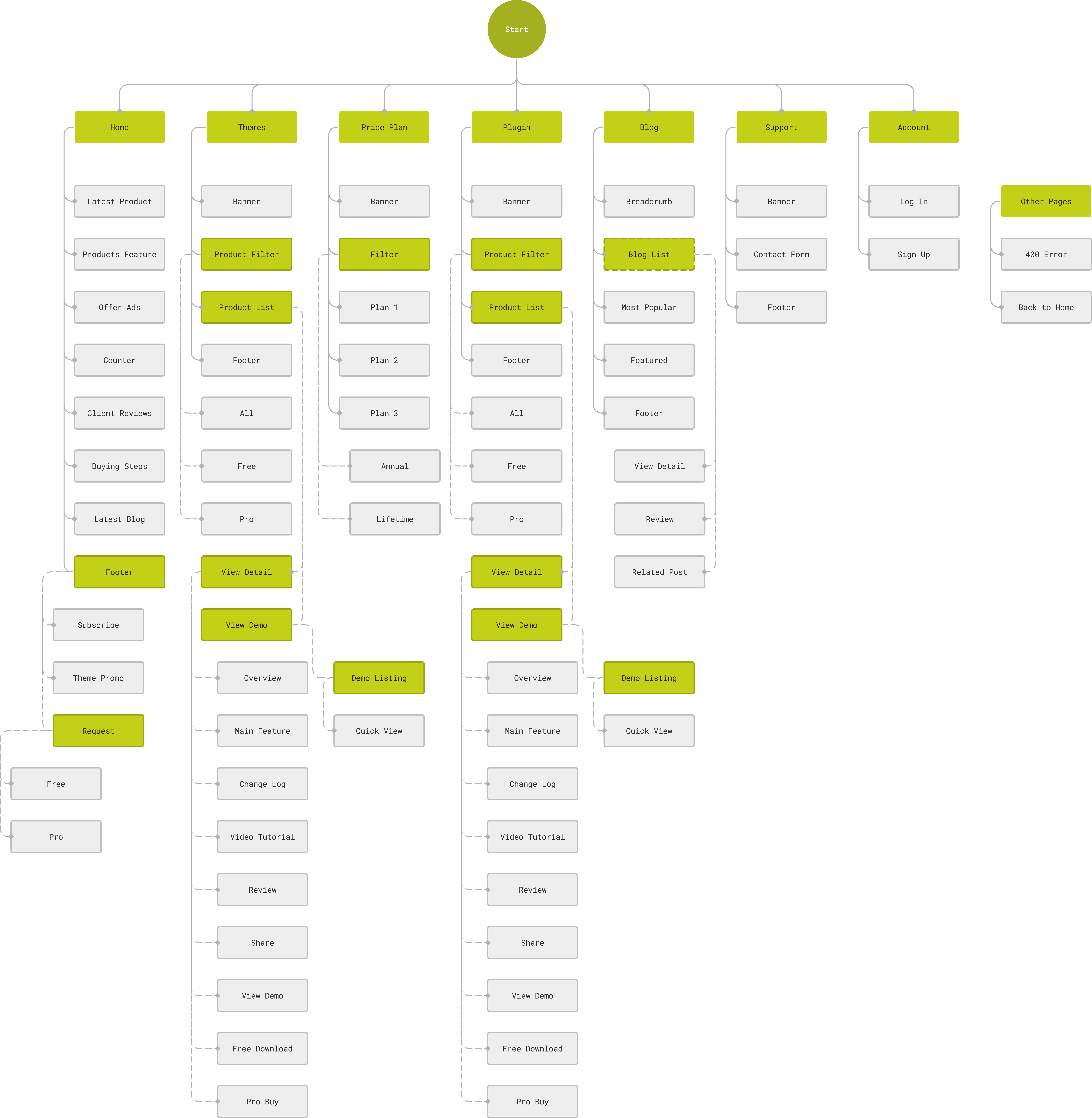
Site Map
How would a user complete a transaction?
We developed a site map based on the specific requirements outlined by the client, with a primary focus on simplicity and user-friendly. Our team carefully analyzed the client’s needs and translated them into intuitive wireframes.
Style guide & ui design
Color palette
To create a cohesive visual experience, we derived a color palette directly from the colors present in the company logo.
#1E193F
primary
#6767C7
sub primary
#D353B4
secondary
#F2B421
sub secondary
#B1B1B1
text
Typography
Our selection of typography was a result of extensive research conducted on various IT companies and a thorough examination of the client’s requirements.
- Heading (H1-H6) - Spartan Font Family
- Body, Paragraph, Text - Spartan Font Family
- link, Button - Spartan Font Family
Ui Design
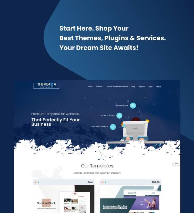
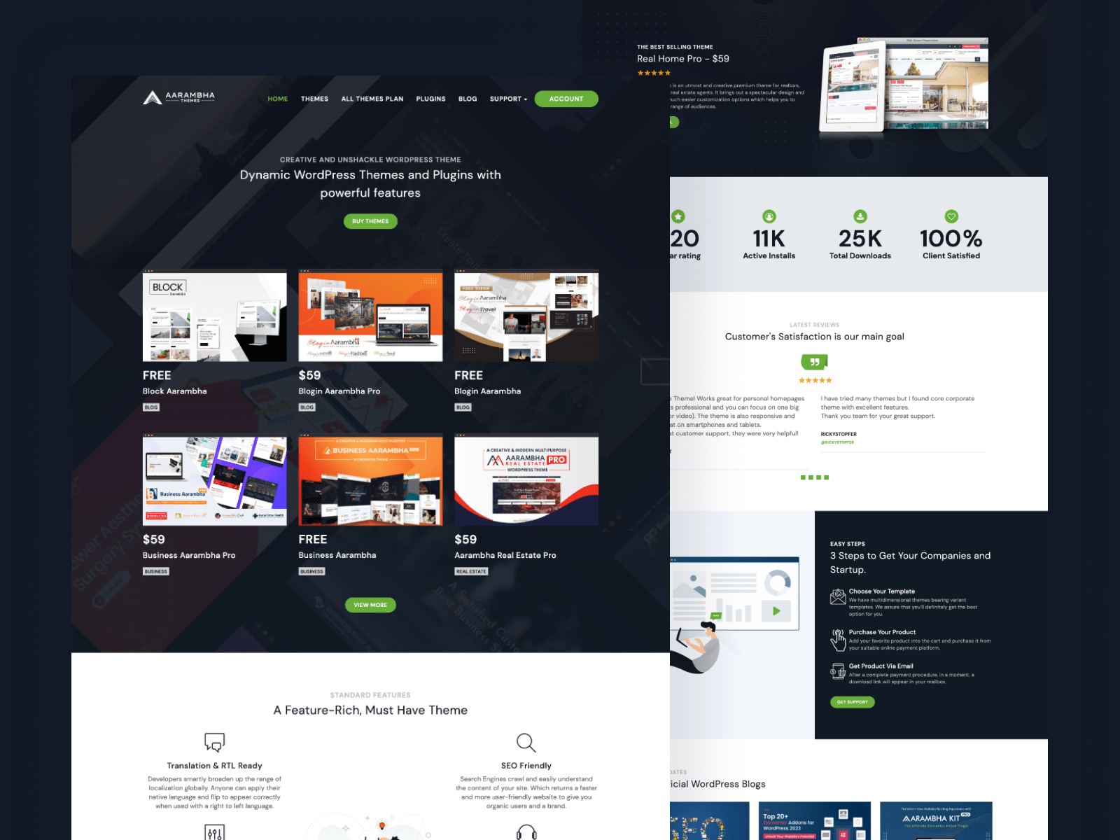
We will overhaul the website’s design to align it with current trends and industry standards. By incorporating modern design elements, clean layouts, and intuitive user interfaces, we will create a visually appealing and engaging website that reflects the company’s identity.
Revisions
Feedback from client and how i improved my design.
We prioritize client feedback and consider it a valuable asset in our design process. Every piece of feedback provided by our clients is taken seriously and thoroughly analyzed. We place great importance on implementing client feedback to the best of our ability, ensuring that their suggestions and requirements are incorporated into the design. By actively incorporating client input, we strive to create a final product that not only meets their expectations but also exceeds them.
- Redesign some pages and section according to client requirements.
- Improve typography according to client requirements.
- Incorporating more modern design elements, clean layouts, and intuitive user interfaces.
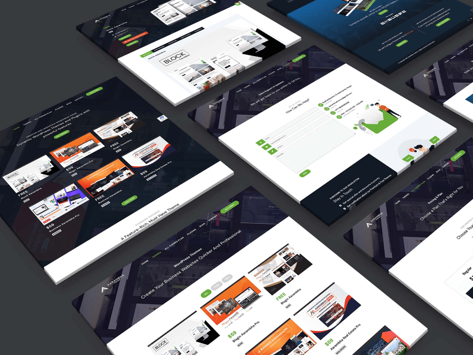
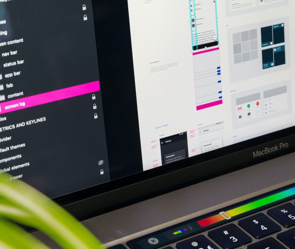
design hand off
How did I hand-off my designs to developers?
I facilitated the smooth transition of the design to the development team, ensuring a seamless hand-off process. Throughout the project, I wore multiple hats and played a crucial role in every stage of the design process, from inception to implementation.
- Dev Meeting
- Documentaion
- Final Presentaion